Sunday, 12 November 2017
Would I Redesign Sets to You?
Welcome to the official Ludicrously Niche examination of the set design for the BBC One panel game Would I Lie to You? If you have literally anything else to do with your time, now would be an excellent moment to go and do it.
Here is the very first series' set. I don't yet have anything to compare it to, so don't have much to say about it. (This state of affairs will not continue for the entire article.)
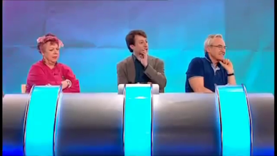
For the second series (which moved filming from the Fountain Studios to BBC Television Centre), the desks the panellists sit behind were completely changed. Everything else stayed the same.
The third series (which was filmed at Pinewood Studios, as would every other series), kept the same set but changed all the colours and designs. For some reason, the show was theming itself around 'little bits of paper', hence the background design looking like a repeatedly folded sheet of paper.
The fourth series kept the 'little bits of paper' theme in the title sequence and TRUE/LIE graphics, but removed it from the backgrounds.
The fifth series sort of changed the gradients a bit. This is gripping stuff, isn't it?
I don't know why they kept on changing the colours of the set slightly, but this is definitely different again.
SEE. IT'S BLOODY VERY SLIGHTLY CHANGED AGAIN (now it's all pretty much one shade). WHAT IS GOING ON HERE.
This is also from the seventh series, and is an amusing sidenote. Lee has also been sitting in front of a green backdrop all this time, and by this stage it looks exactly like somebody's forgotten to greenscreen the background in.
I'm not making this up, am I? That's definitely lighter than it was before?
SERIES 9 LOOKS MORE OR LESS THE SAME. THEY'VE PICKED SOMETHING AND STUCK TO IT. So does series 10, but you'll have to take my word for it.
(NB: Varying quality of video might be a factor here. In which case this piece was an even bigger waste of time than I previously thought.)
I could try and make this article a little more worthwhile by sticking in a rant about how appallingly the BBC treat this show in the schedules. But I'm not going to.
Subscribe to:
Post Comments (Atom)


Love to see similar posts for other panel shows. I maintain 'They Think It's All Over' jumped the shark when they got rid of the ball icons in front of the panellists.
ReplyDeleteWhat I'd really love to see is a complete list of every headline and face ever featured on the HIGNFY revolving boards. You could convincingly argue that they are of genuine historical interest.